ACCESCASH, the new name of KINGA !
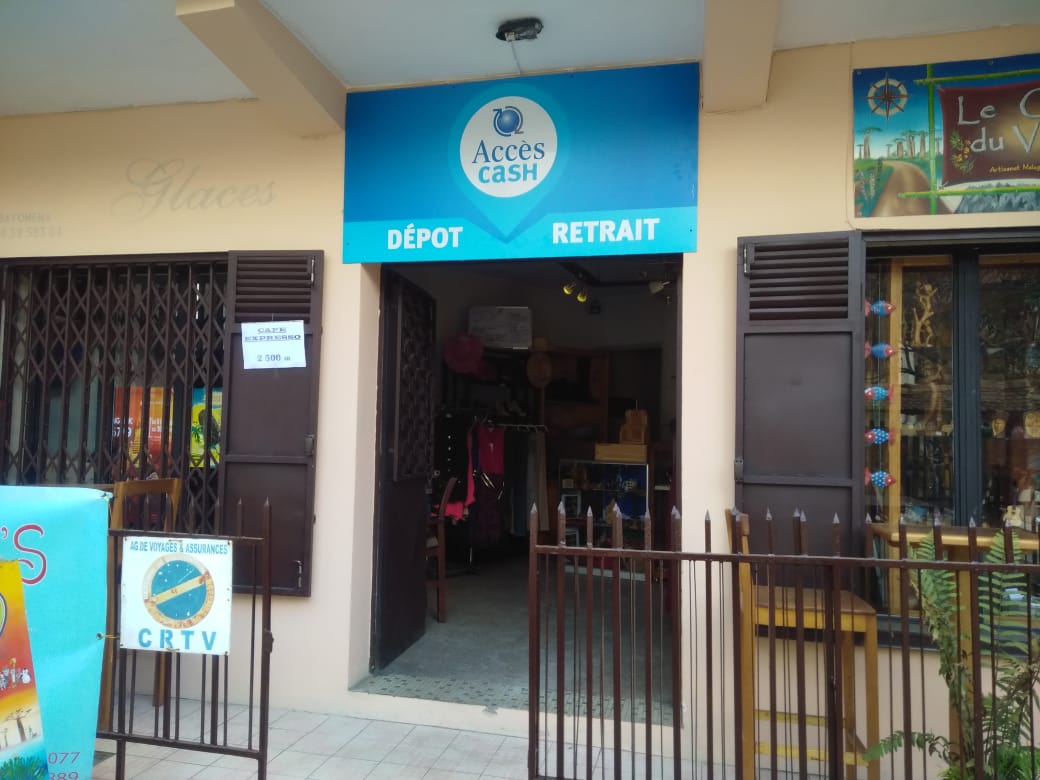
The Marketing department is at present in full preparation of the “branding” of AccèsCash. This branding aims at establishing a significant presence of the bank with regard to the other points of retreats and deposits such as Mvola, Airtel Money, Orange Money either still Baobab of Microcred.
Current Kinga was at the base a banking Agent, to make the deposits and the retreats of our customers. However, logo of Kinga sowed questions with regard to the used colors and with regard to the arrow which seem to be similar of that of Orange Money.

We thus want to keep(guard) the identity of the bank by changing the name and especially the colors which should correspond to the graphics standards. However, the turquoise blue color of AccèsCash is used so as to distance itself from other points of retreats(withdrawals) and from deposits(warehouses) and so that it is more visible by the customers.